laurids.io
Hi, i'm Laurids
I’m an Interaction Designer and Frontend Developer from Berlin, Germany.
I design, build and code Interfaces, Apps, Websites and Services.
My passion is connecting design and code.
Selected Projects
HYMN
An App to use all music streaming services and network speakers in one place.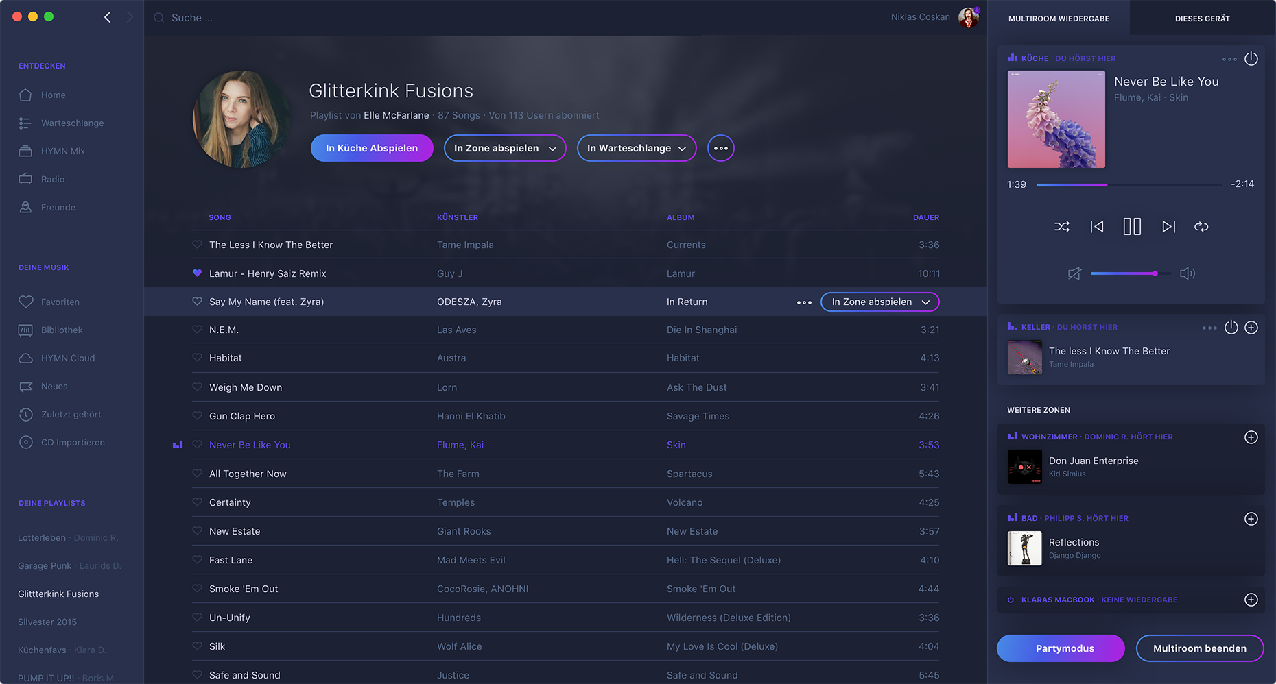 www.hymn.fm
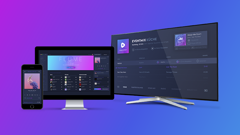
HYMN originated from my Bachelor's thesis in July 2017. HYMN is a music app that allows its users to connect multiple music sources like Spotify, SoundCloud or YouTube and listen to Songs of their respective catalogues in a single app. Users can create service-spanning playlists and connect all AirPlay and Chromecast speakers to a custom Multiroom system.

If somebody wants to play a song in HYMN, the app automatically searches for the version with the best quality available in the catalogues of the activated services (like Spotify or SoundCloud). When HYMN can't find the song in any of the activated service's catalogues it tries to play the song from YouTube.
If users want to listen to their music on the go they can install the HYMN server app on one of the supported platforms or subscribe to HYMN Cloud.
Network speakers & and devices
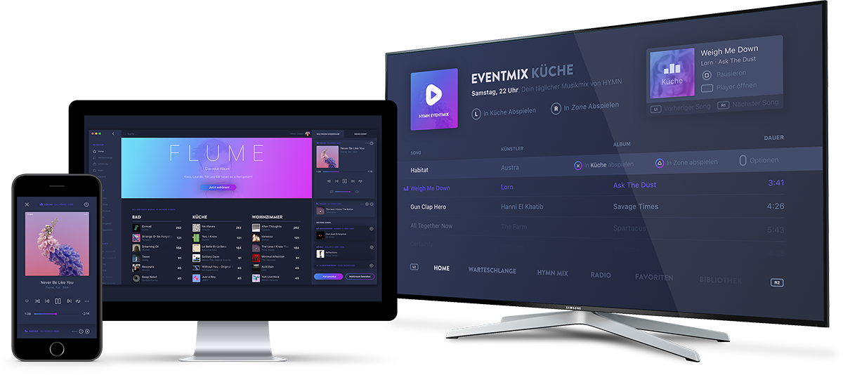
Users can use all their devices that are supported by HYMN as a speaker or connect AirPlay and Chromecast speakers to start synchronized playback across multiple rooms.

HYMN Cloud
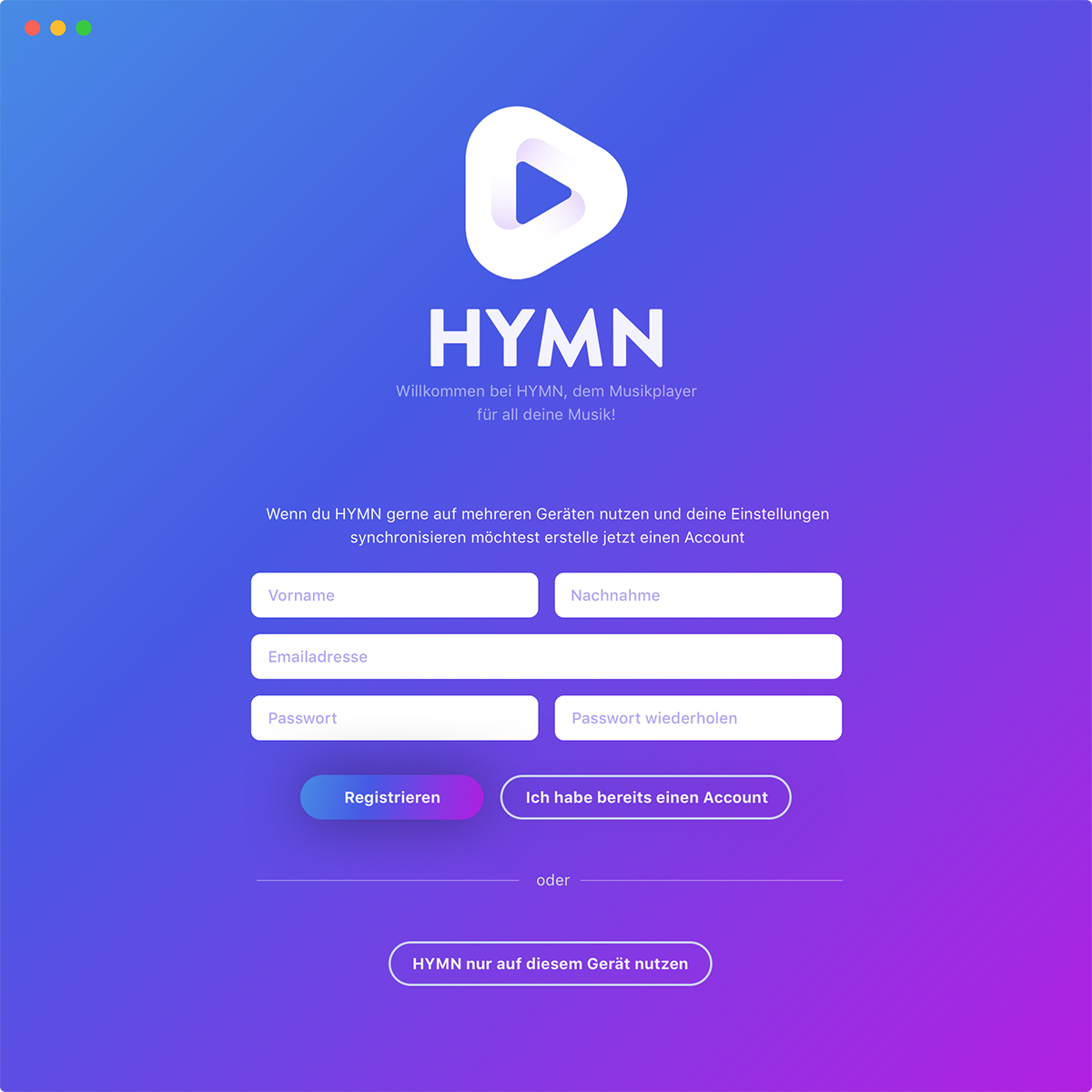
To allow users to listen to their musik on the go HYMN can upload all music from their private catalogue to the cloud.
HYMN Cloud also allows to sync playlists and multiroom speaker settings, so HYMN only has to be configured once but can be used on endless devices.
Multiroom with friends
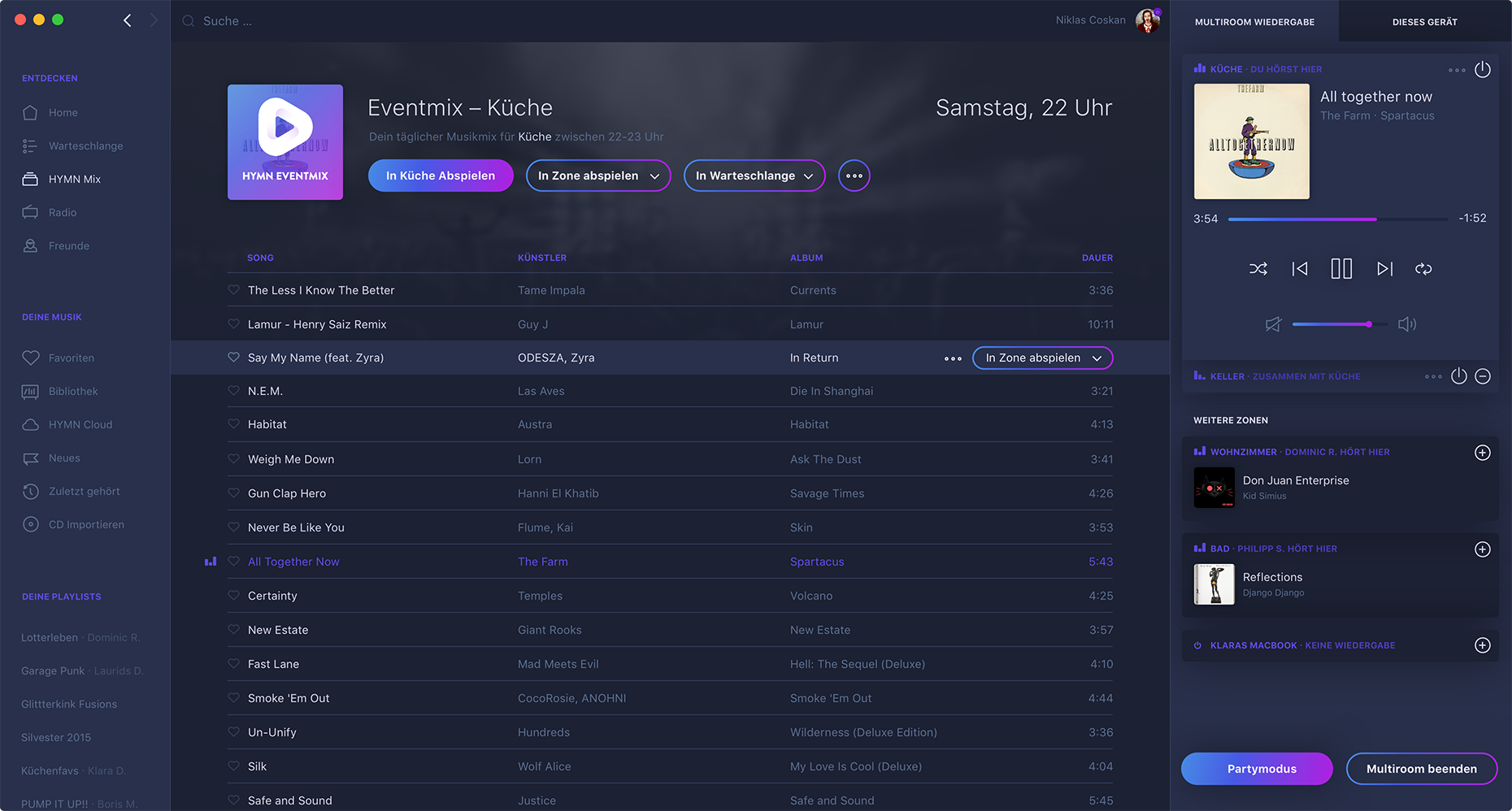
All HYMN players found on the current network can be used as playback devices. Those devices and AirPlay and Chromecast speakers can be connected to a multiroom system. Everbody in the network can use them and just play songs with Drag and Drop!
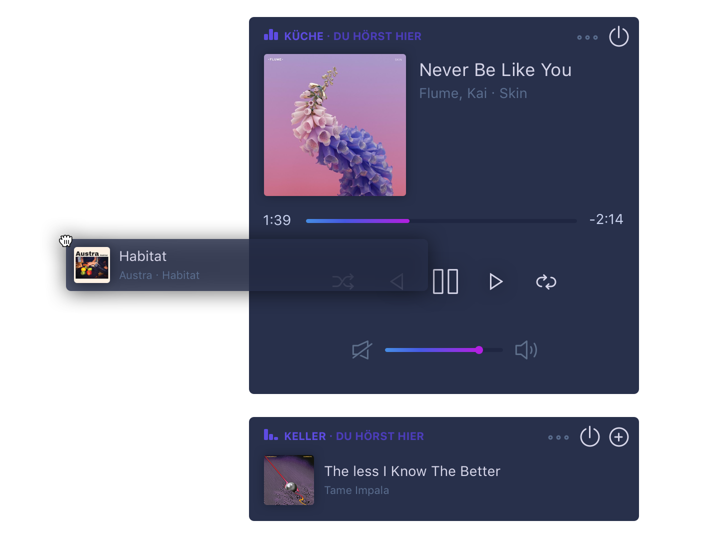
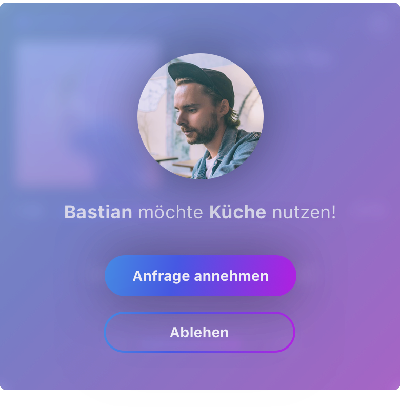
Friends who come over can use HYMN too and control the playback. If somebody else is listening to music in a room a user can't just take it away to start his own music, he has to send a takeover request first.
HYMN Mix
Users who often listen to different genres of music in their (p.E.) livingroom compared to their (p.E.) kitchen at noon can use HYMN Mix. HYMN Mix uses machine learning to analyze listening habits and created roomplaylists which suit the current daytime. If somebody loves Hip Hop at 21pm on Saturdays, HYMN Mix adapts to that if the user is in the right room. That way HYMN can recommend new songs that fit to the current mood or play popular songs for the current time and room.
HYMN is multiplatform
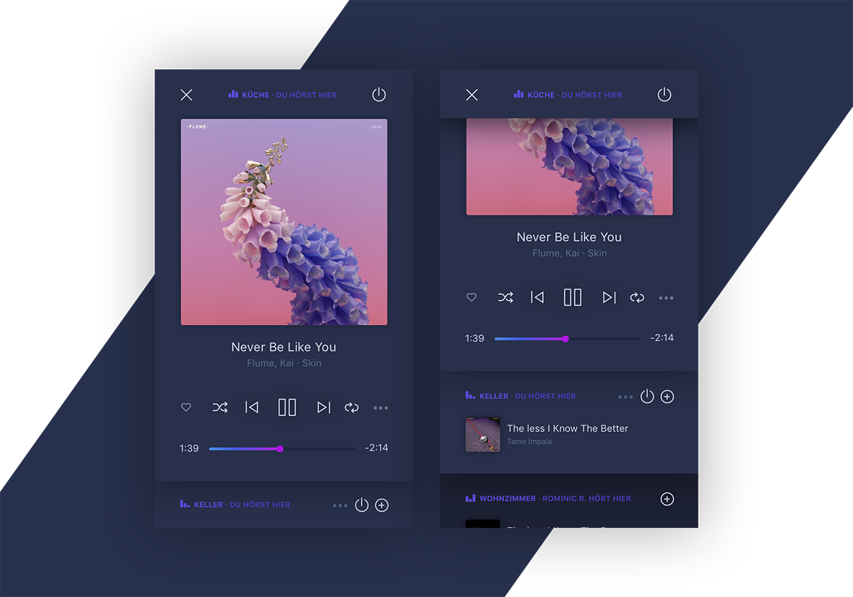
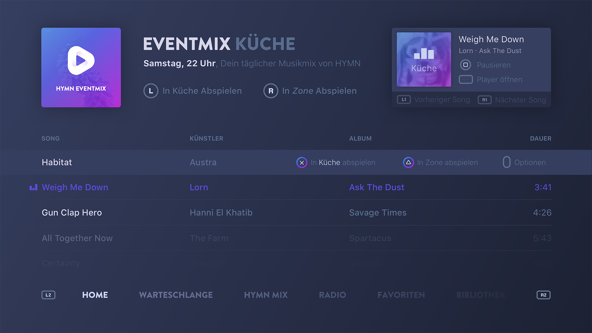
HYMN cannot only be used on computers but on Smartphones, Tablets or even gaming consoles.
To learn more about HYMN or download my Bachelorthesis please visit www.hymn.fm.
Designing for Inclusion
A tool to enable exploration and discovery for visually impaired. www.polo.band
Created with Philipp Steinacher, Dominic Rödel & Henrik Hagedorn
We as designers can help to remove obstacles, enabling people to participate in society no matter their individual challenges. Let’s imagine a future of adaptive systems that puts human empathy at their design core.
The project around „Designing for Inclusion“ was part of a class in my bachelors degree course in Interface Design at the Potsdam University of Applied Sciences in collaboration with Microsoft Research and the Microsoft Design Expo 2015.
In the beginning the project started without any real constraints in terms of the expectation of an actual product and prototype. The task was to explore a context dependent disability and understanding not understanding it as an attribute of a person. Our design solutions were supposed to address a person’s permanent, situational and temporary constraints.
The goal was to create a product, service or solution for someone with a context-dependent disability. It must meet a clear need and be extensible to wider applications and should have a realistic chance of adoption.

Research
To familiarize ourselves with different impairments, their meaning to those who are affected and how they live with it on a daily basis, we did some basic and naive low fidelity prototyping to address a few topics. That lead to a common ground to talk about topics and making sure that we all felt we could talk about difficult topics with in a same and confident language.
Furthermore, we wanted to understand the influence of design in the context of disabilities better and consulted articles and books like „Design meets disability“ by Graham Pullin that argues that some impairments combined with well designed assistants can make affected, superior to able-bodied people.
Quite quickly we settled on the topic of visual impairments since we realized that there is a huge group of partially sighted people world wide. While we argued that there are a lot of assistants out there to help people out in situations where they need help.
Interviews
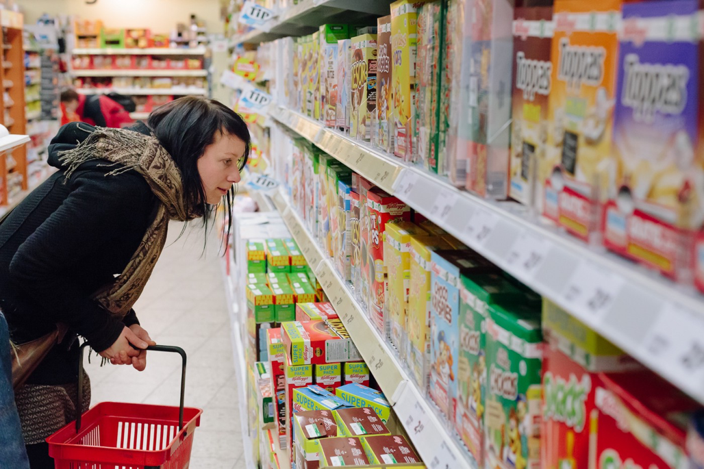
To better understand how affected people live with constrained eyesight, we started to talk to experts and partially sighted people. We had the chance to follow and observe some of them during common daily tasks.
Soon enough we focused on a more specific area: How do visually impaired go grocery shopping. Therefore, we asked them to go grocery shopping with us following them to develop insights into their behaviour and understand their difficulties. In the end we could break down our findings into five main insights:
- People prefer to hide their impairment. Hence they don’t want to use obvious assistive tools, for example a magnifying glass.
- Visually impaired memorize products by colors and shapes if possible.
- Knowing a store is crucial to find a desired item and rearranged special offers in the middle of an isle are obtrusive.
- Exploring new products is hard since positions are not known beforehand.
- Existing way finding systems for sighted people are mostly impossible to use.
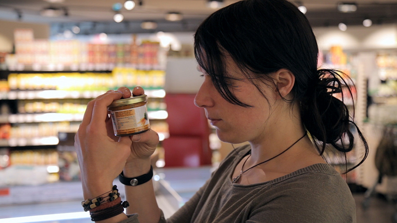
Originating from our main insights we concluded that visually impaired people find themselves with two big problems that we wanted to tackle:
First of all, the discovery of new products is challenging, frustrating and time consuming. Therefor, exploration is luxurious.
Secondly, people don’t step out of their known structures and buy the same things over and over again because they know exactly where to find them.
Concept
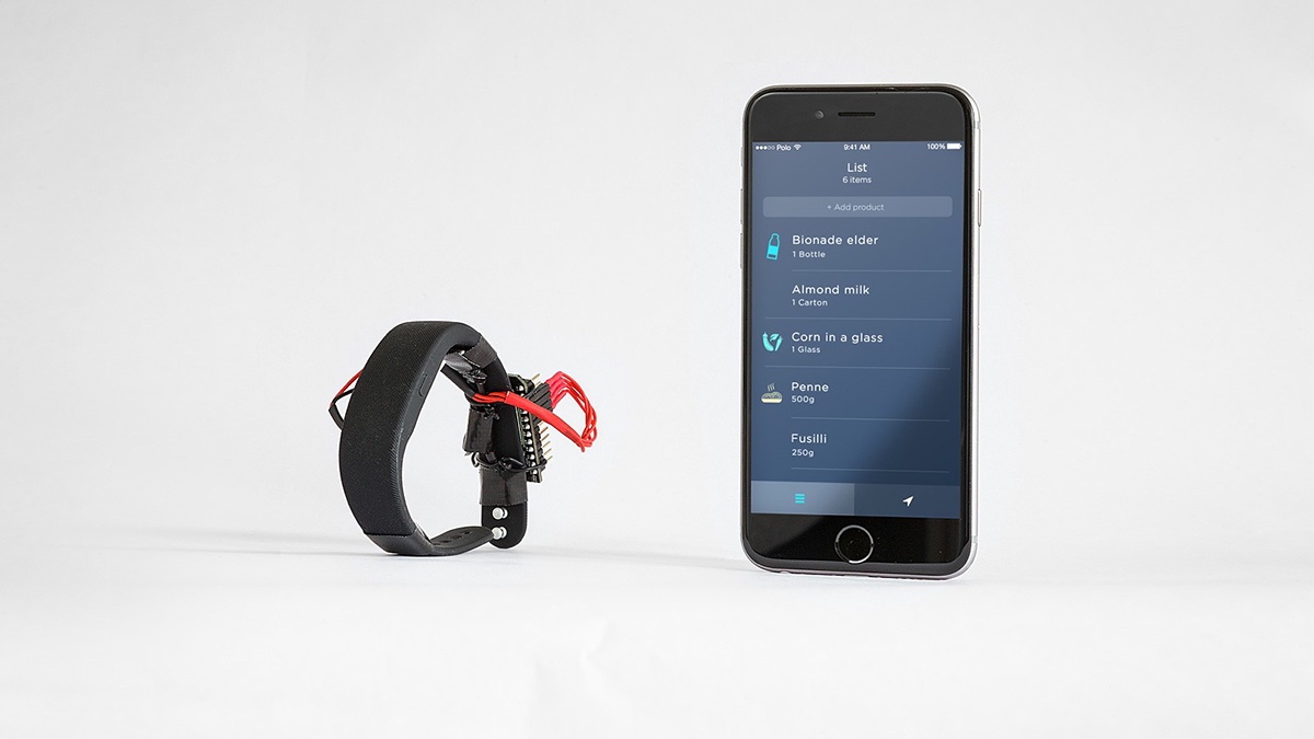
Based on our initial research we developed a smart wearable: Polo is a discovery tool for blind and sighted people alike. It consists of a bracelet and a companion app, guiding you around. The bracelet provides directional information by vibrations. It is also equipped with a bone conduction hearing aid for communicating product information while keeping the user’s ear free. The slower you move, the more detailed the product information are.
We propose a mental model that argues that navigating the supermarket is based on three different knowledge layers that allow you to find different kind of products or explore new items.

Taste Layer
The understanding of the general layout of the supermarket allows you to find the general area where you might find a product.
Architecture Layer
If you’re familiar with a specific store, you understand which isles to walk to locate the item you’re looking for.
Product Layer
The knowledge of items that you buy frequently allows you to find it without even thinking about it.
While sighted people can easily make use of the top two layers to find new products and explore a diverse set of products, visually impaired have difficulties to move knowledge up the hierarchy. Hence, it’s hard to find products they haven’t used before.
To resolve this major issue, Polo guides a user through the supermarket. When the user walks at regular speed, the bracelet will announce the general contents of an isle via the bone conduction hearing aids. As soon as the user walks more slowly, the device announces what’s in the shelf in front of them. The moment the person reaches for a product, Polo will call out the name and as soon as the product is in the hand, Polo will automatically tell the price and necessary details about ingredients.
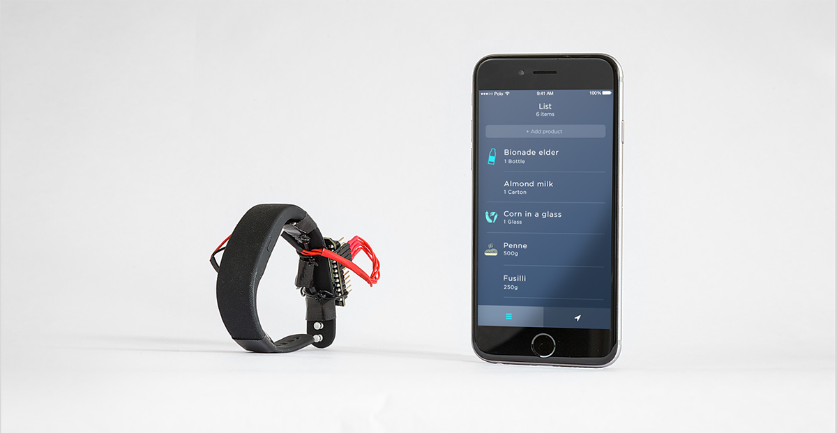
Polo does not only allow blind people to explore a grocery store with all it’s variations of different products and tastes but also a wide range of diverse people who might be in need of help within the store. We distinguish between three different but overlapping user groups who would have a more convenient shopping experience.
Permanent
Permanent visually impaired people can use Polo in their daily life to reclaim their excitement for different taste on their own..
Temporary
Temporary blind people, e.g. a person who had a treatment at the eye doctor or people who have a hard time to locate themselves in a new store can make use of Polo to follow their daily routine as usual without additional help.
Situational
Sometimes customers have to find something really quick on time. Polo allows them to locate a specific product and navigate to them in no time and without any obstacles.
Prototyping & Validation
To test and validate our concept we built a first prototype using tape, wires, vibration motors and a spark core micro controller. The technology behind polo isn’t too sophisticated, since it just uses bluetooth localization to navigate the store and NFC tags to identify individual products.
We decided to create a low fidelity prototype to determine interaction patterns and learn first hand how it would feel the most natural to use such a device and service. Hence we could also test if our assumptions about the whole experience would work out with a working device on our arms.

To test the experience of navigating the store, we set up our bracelet with vibration motors and a small audio system which we could both control remotely. Therefore we were able check if we can expand the mental model of a grocery store by guiding a test subject around in our virtual mockup store. We were able to test different vibration patterns and isle category announcement granularities. Since we had the test platform around our arms and could adjust the different parameters we could learn and make the system better while we tested it with our users.
After a some adjustments we realized that distinguishing between the four vibration motors for direction works extremely well. Users could easily determine different directions and follow them, even when trying to grab a small item. At all time the test subjects had a clear idea about their surrounding even though they couldn’t see at all or just partially. The promising results made us incredibly excited about the feasibility of such a product and how it can make the shopping experience more convenient for everybody.
Retrospection & Learnings
This concept of contextual information dependent on movement patterns presented to the user by vibrational patterns and audio information easily adopts to other scenarios where a user finds himself in a more or less unknown three dimensional information space. Imagine a library guiding visually impaired people to the book they want or pretty much everyone within a museum using an audio guide: Changing the density-level of audio information dependent on the way a user moves through the museum, resting longer at works he finds interesting with more detailed information and rushing through parts he doesn’t care about at all with very basic information, seems like a very promising base for an audio guide — not only for visually impaired.
The design process itself has taught us a lot about the use of good user research and being guided by a prototype driven approach. While we were very focused on getting the interaction details to the right level, our advisors were very helpful to remind us to think about the whole experience and transport the message behind the product.

Polo has been designed as part of the Microsoft Design Expo 2016.
We are proud that the project has been nominated for the Interaction Design Awards 2016 shortlist by the Interaction Design Association and nominated for the
People’s Choice Award of the IxDA Interaction Awards.

Background
Learn more about how the team created Polo in our more detailed project blog.
Rocket League Garage
Gamingcommunity for Rocket League and webbased streaming tools. www.rocket-league.com
Created with Chris Dolman & L. T.
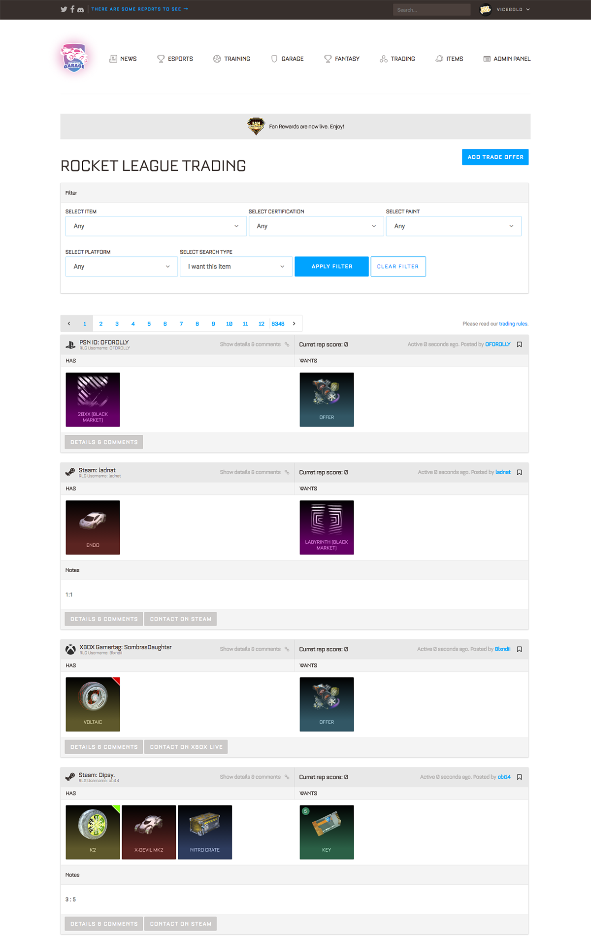
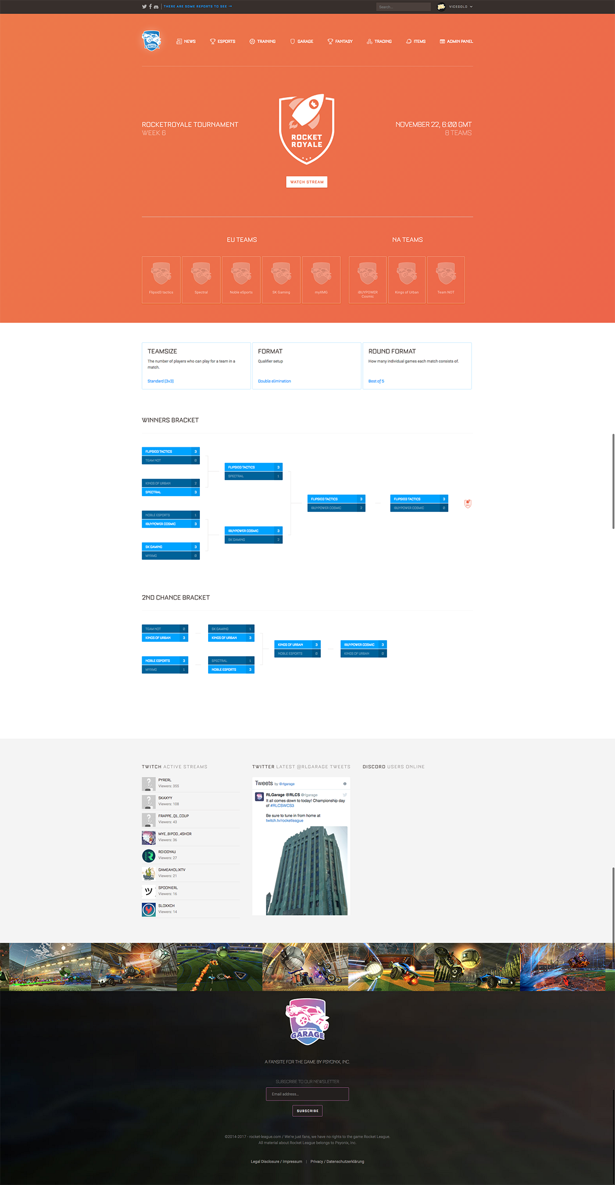
Rocket League Garage is a central hub for everything Rocket League. From the latest news and esports event listings to interviews, our fantasy RLCS game and a place to find other players looking to trade, the site has something for every Rocket League fan.
Rocket League is a vehicular soccer video game developed and published by Psyonix.
I founded Rocket League Garage in 2015 and soon Chris Dolman and L. T. jumped in. We created a platform where players were able to create tournaments or leagues, read articles and message each other.
Later in 2016 we created a trading system to allow users to offer their ingame items or search for other player's items. The trading section brought many new users to Rocket League Garage.
At Rocket League Garage i'm responsible for everything Design, CSS, HTML and JavaScript.
Stats of rocket-league.com
- 580.000 registered users
- 2,7 million pageviews per day
- #3800 on Alexa website ranking in the United States of America
Webbased on-air tool
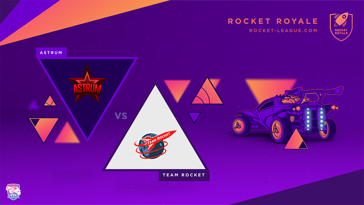
We also created a streaming tool, that allows us to have a dynamic on-air design for our live-events streamd on twitch.tv.
With web-technologies such as HTML, CSS and JavaScript we were able to create a highly customizable system for our live events like tournaments or any other type of show.
Medusa's Son
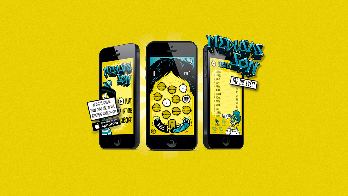
The greatly feared Medusa gave birth to a new child, bring him down in our iOS game! www.medusas-son.com
Created with Niklas Coskan & Serhiy Medvedyev
The greatly feared Medusa gave birth to a new child - a boy! Because he is such a little rascal, you have to help her to calm him down! To do that, you have to close as many eyes as possible, or you get stoned by the son‘s staring sight if an eye closes before you hit it! Each eye gives you some points for your score - depending on your speed and level.
How to play the game
You can close an eye just with a tap on it!
Sometimes you tap on a bonus eye - it‘s shown on Medusa‘s Son‘s forehead! There are different bonus eyes:
- Extra life - so you can miss an eye if you‘re too slow ;)
- Rage Mode - just swipe all over his face to close his eyes!
- Extreme Rage Mode - just swipe all over his face to close his eyes and get a triple amount of points for each swiped eye!
- Slow Motion - Take a breath, eyes open very slow now!
- Triple - gives you a triple amount of points per eye!
In the beginning eyes stay open quite long and begin to close quicker, depending on your level. The faster you press the eyes, the more points you get! So hurry up!

Watchever 2014
Fictional Redesign of Watchever focused on interruption-free watching.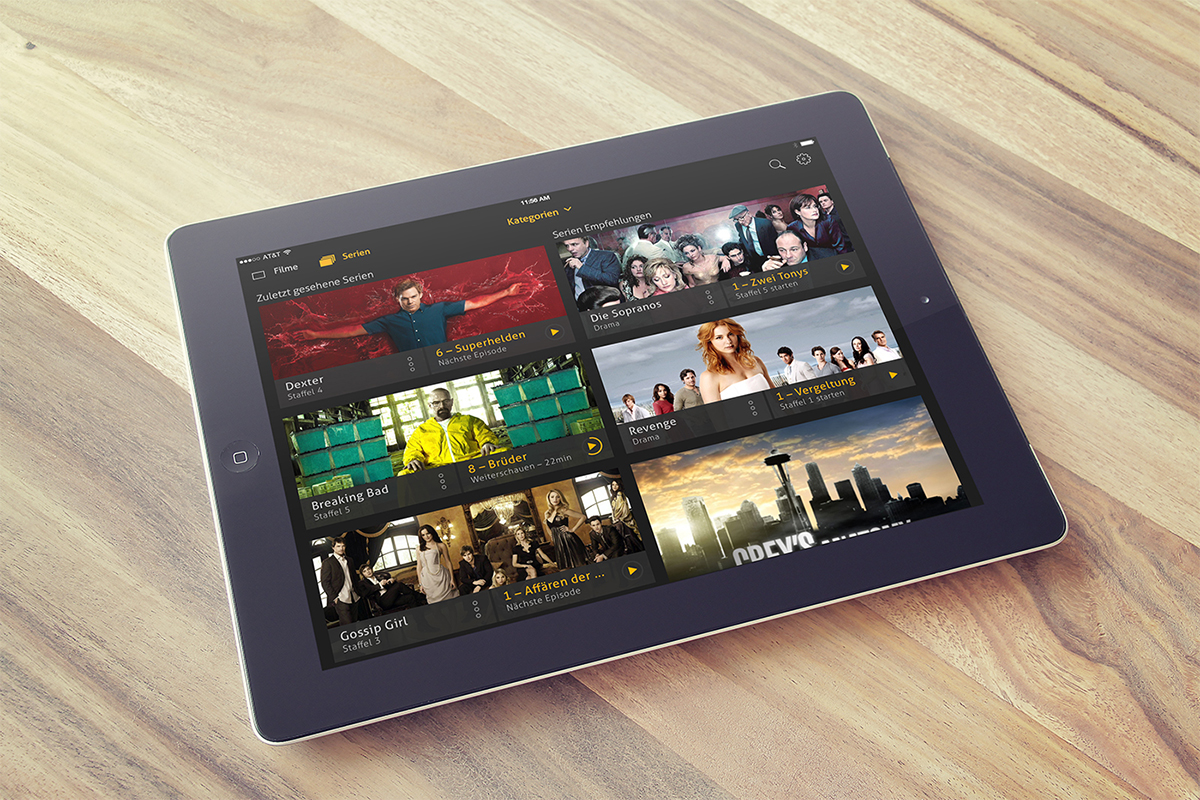
Created with Ben Schmitt & Constantin Eichstaedt
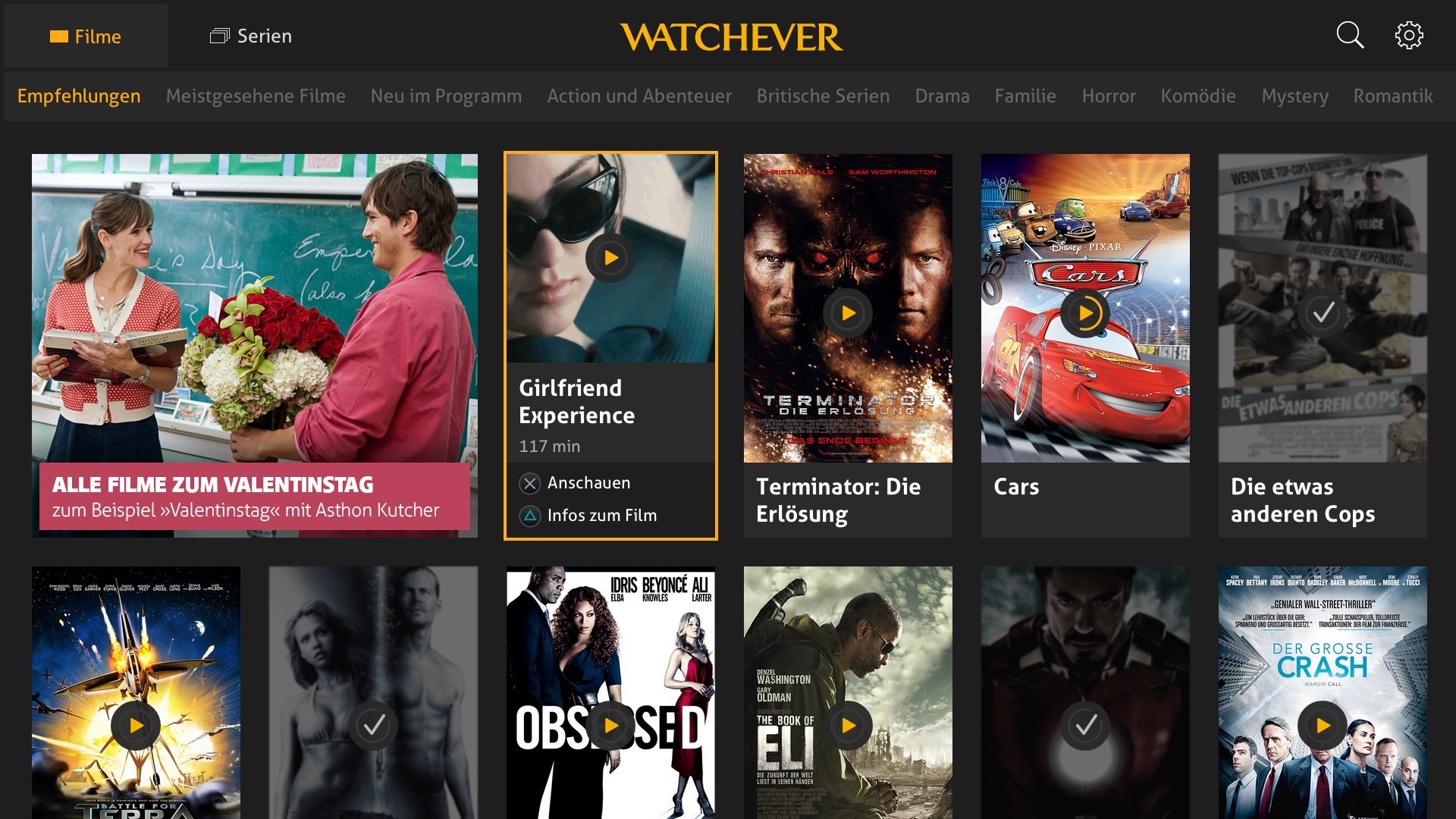
Watchever 2014 is a student project and ficitonal redesign of a former movie/series streaming service in Germany created at University of applied Sciences Potsdam.
At the beginning of the project we asked ourselves what would be the most interesting feature of a streamingservice today (in 2014).
Since other streamingservices didn't offer the option to see at which episode a user stopped a show, or even at which minute the user interrupted a movie we created our "One Sentence" for our redesign:
Watch and resume all your movies and show on every device
We created HTML/CSS/JavaScript based prototypes for iPad and PlayStation 4 while considering the respective User Interface Guidelines of these platforms.
iOS prototype
Password: FHP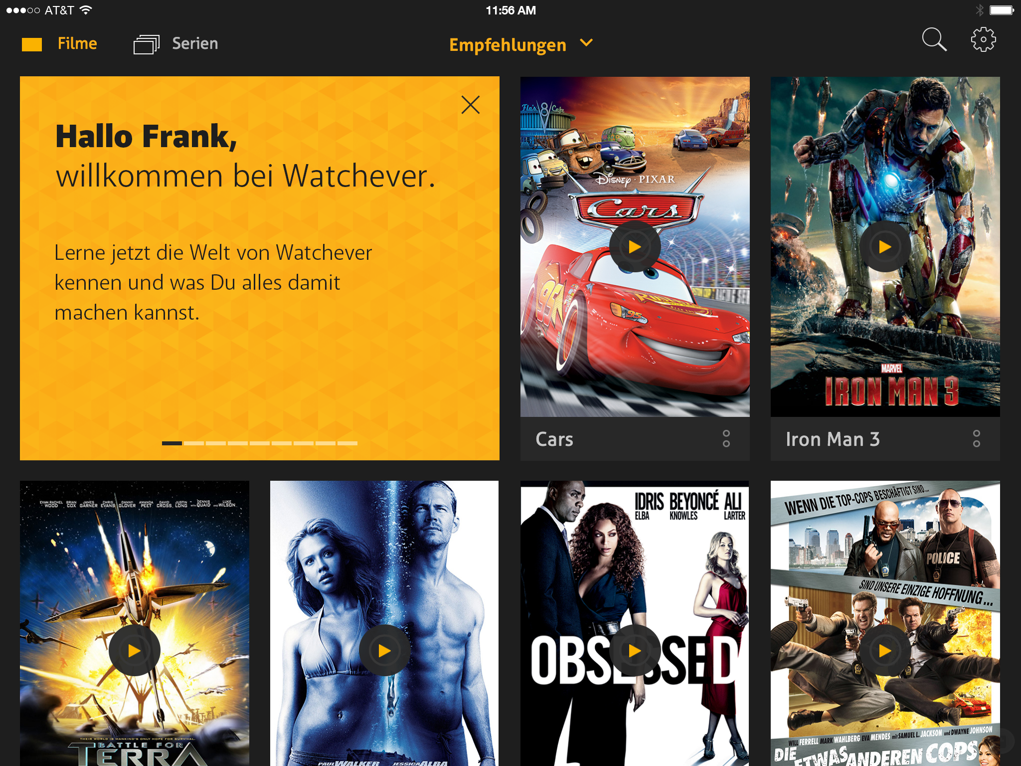
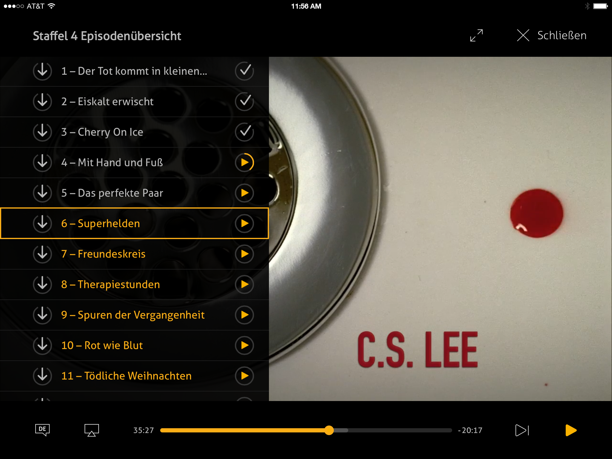
PlayStation 4 Prototype
Our PS4 Prototype was based on HTML/CSS/JavaScript and was fully controllable with a real PlayStation 4 controller, which allowed us to really immerse into the differences with this kind of user input device.
Password: FHP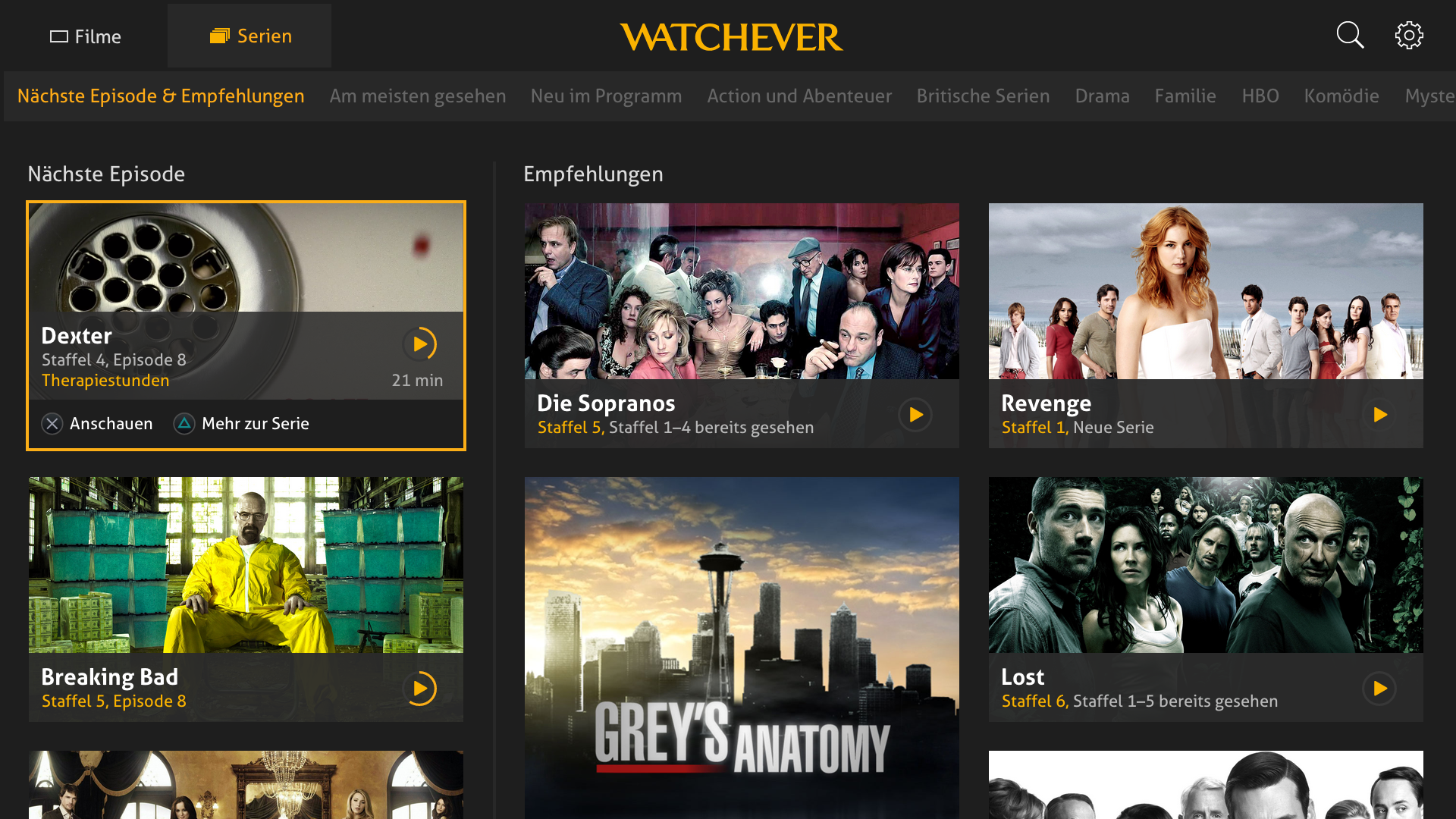
Responsive Ads
Responsive ads for Samsonite's new suitcases.
At SOWHAT! i created responsive purely based on custom CSS ads where a single file should be used for different banner sizes. Based on CSS media queries i was able to fit different aspect ratios into the same ad.
Nature Me by Douglas
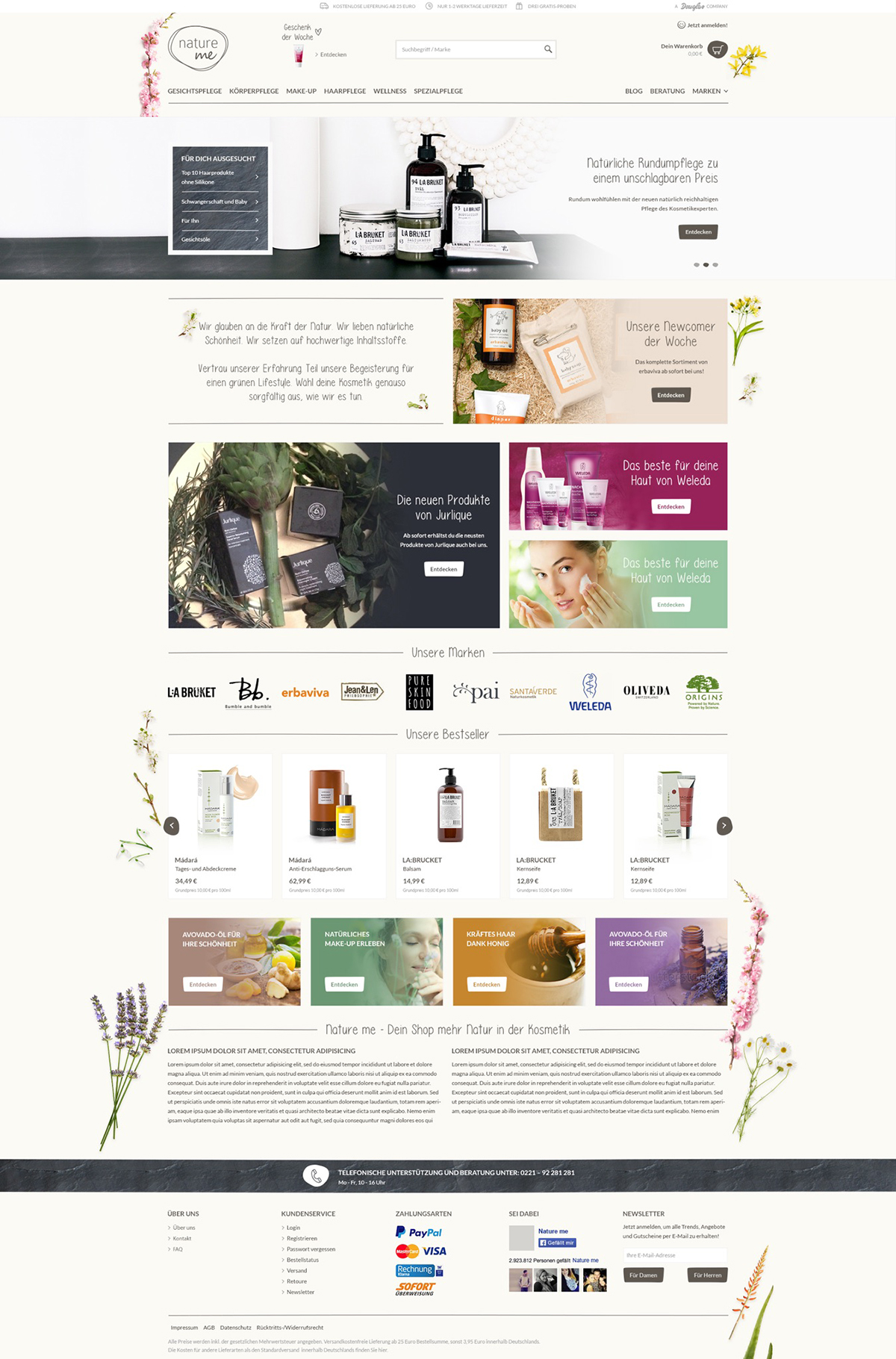
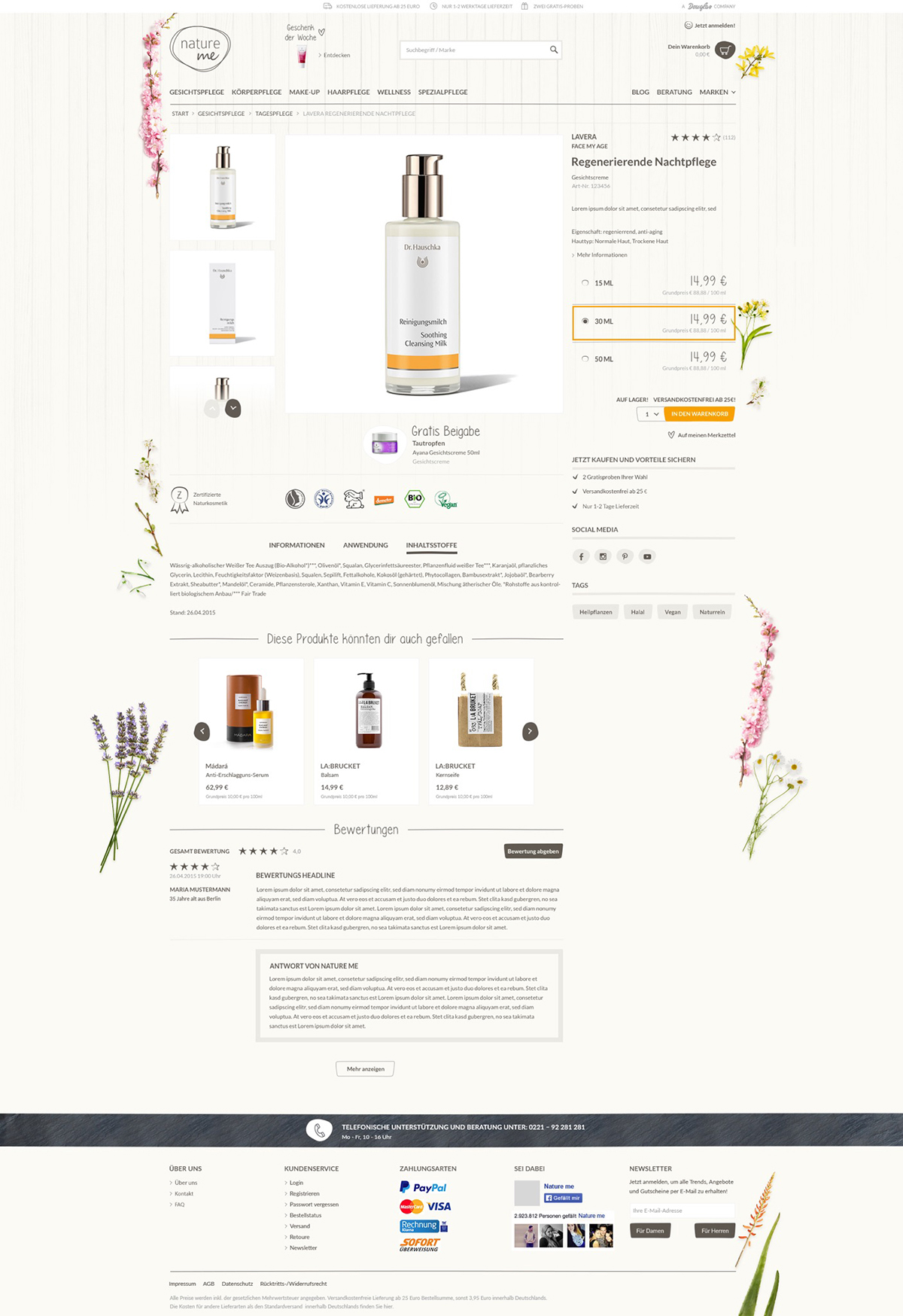
B2C-Onlineshop. Frontend Development for Douglas' Onlineshop for natural cosmetics.
B2C-Onlineshop by Douglas. At SOWHAT! we created an Onlineshop for natural cosmetics. I was part of the Frontend Development team and was mainly responsible for responsive SVG elements and the "Living CSS styleguide".
I also worked as the link between the design and frontend development department.

STABILO
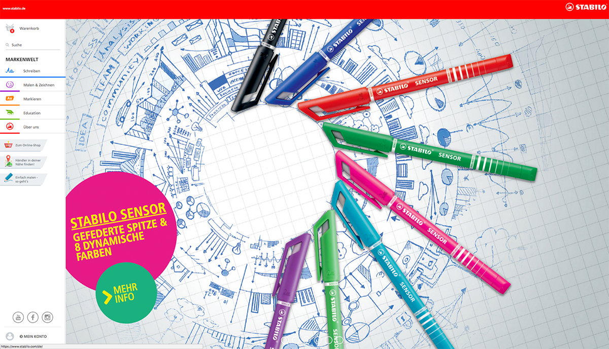
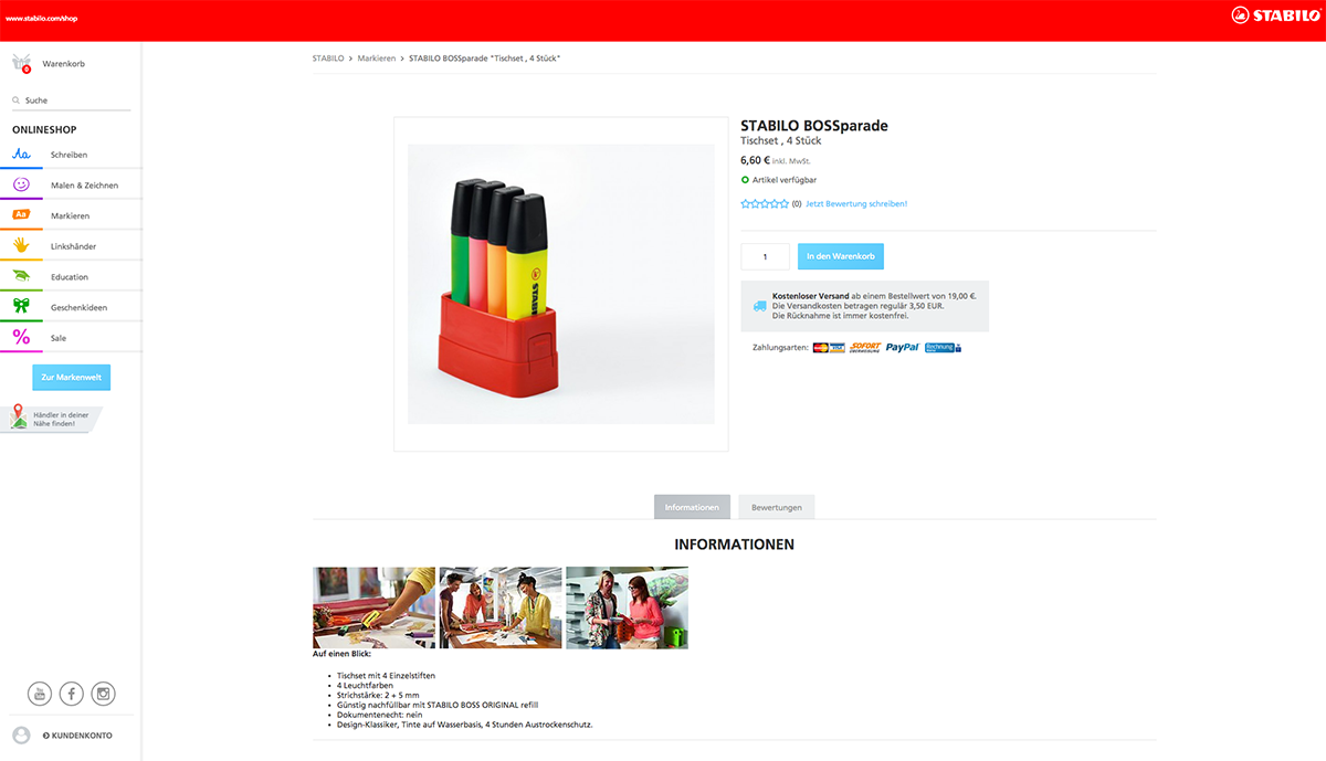
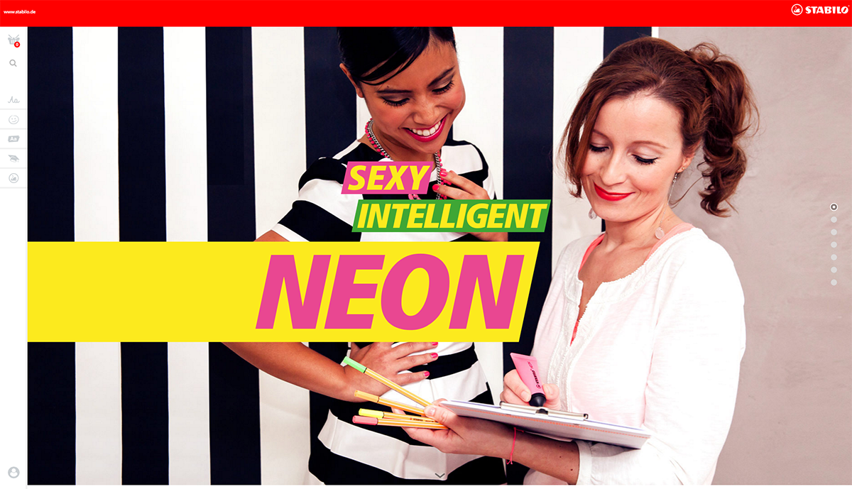
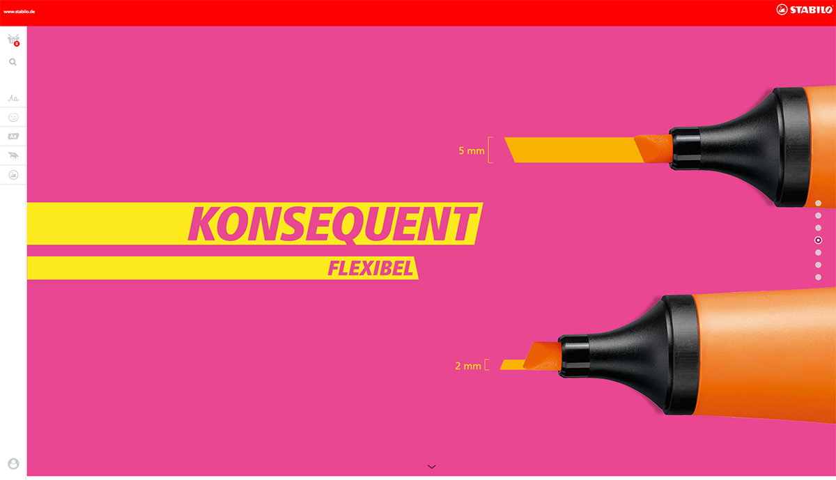
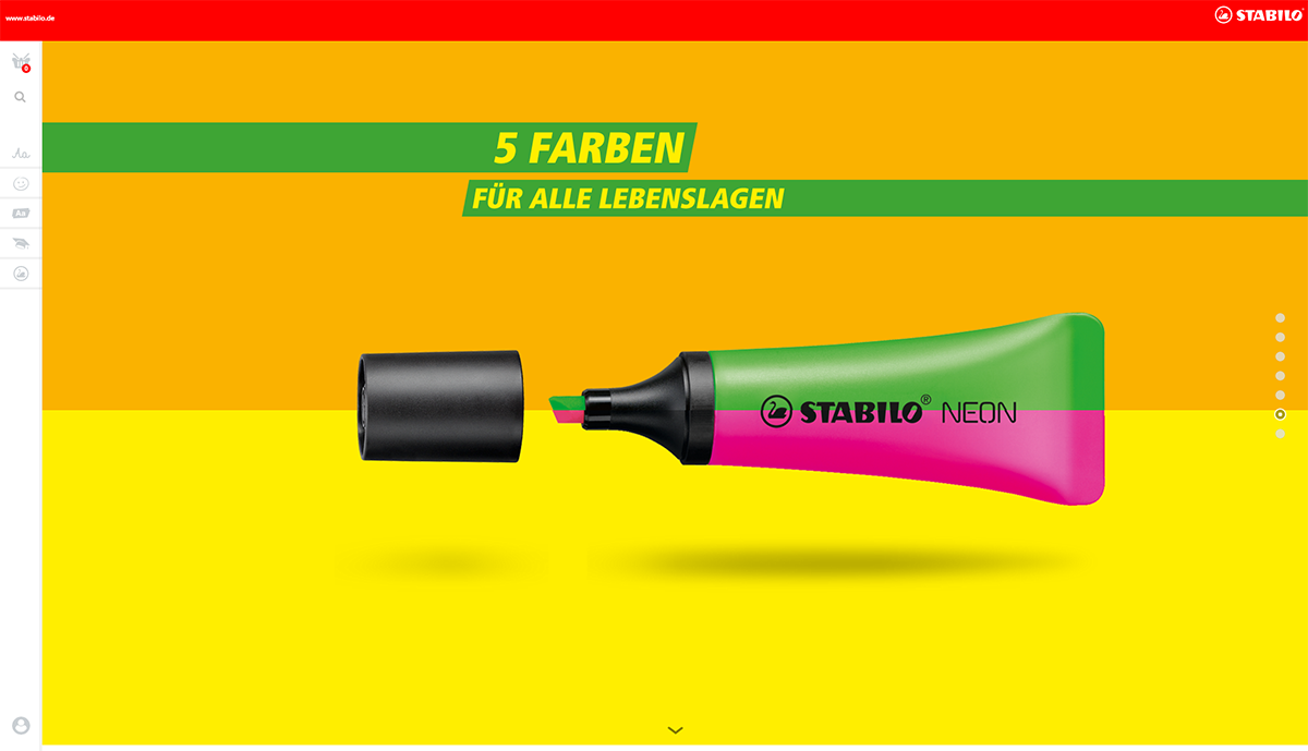
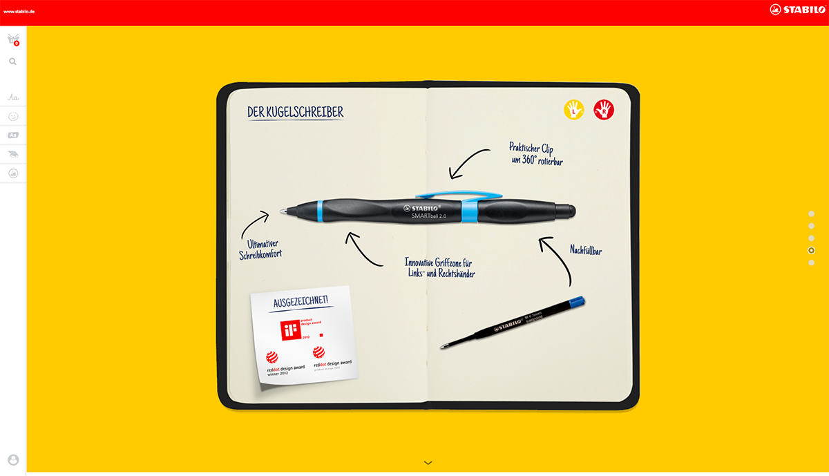
Frontend Development for the B2C-Brandpages and B2C- & B2B-Onlineshop of STABILO, the world-famous pencil manufacturer. www.stabilo.com
For the world-famous pencil manufacturer STABILO we at SOWHAT! created a full set of responsive parallax brandworld pages and a B2C shop for all of their pencils and accessories.
I entered the project a few weeks after launch and led the frontend team afterwards.
I also worked as the link between the design and frontend development department.

K-Fee
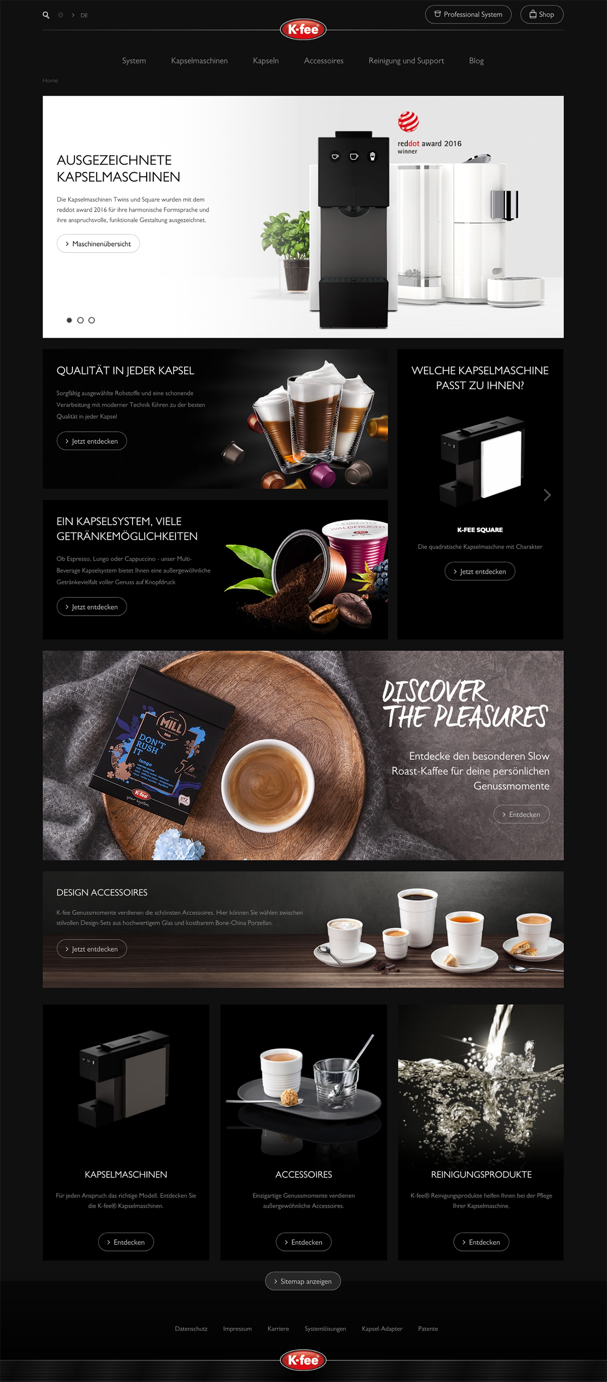
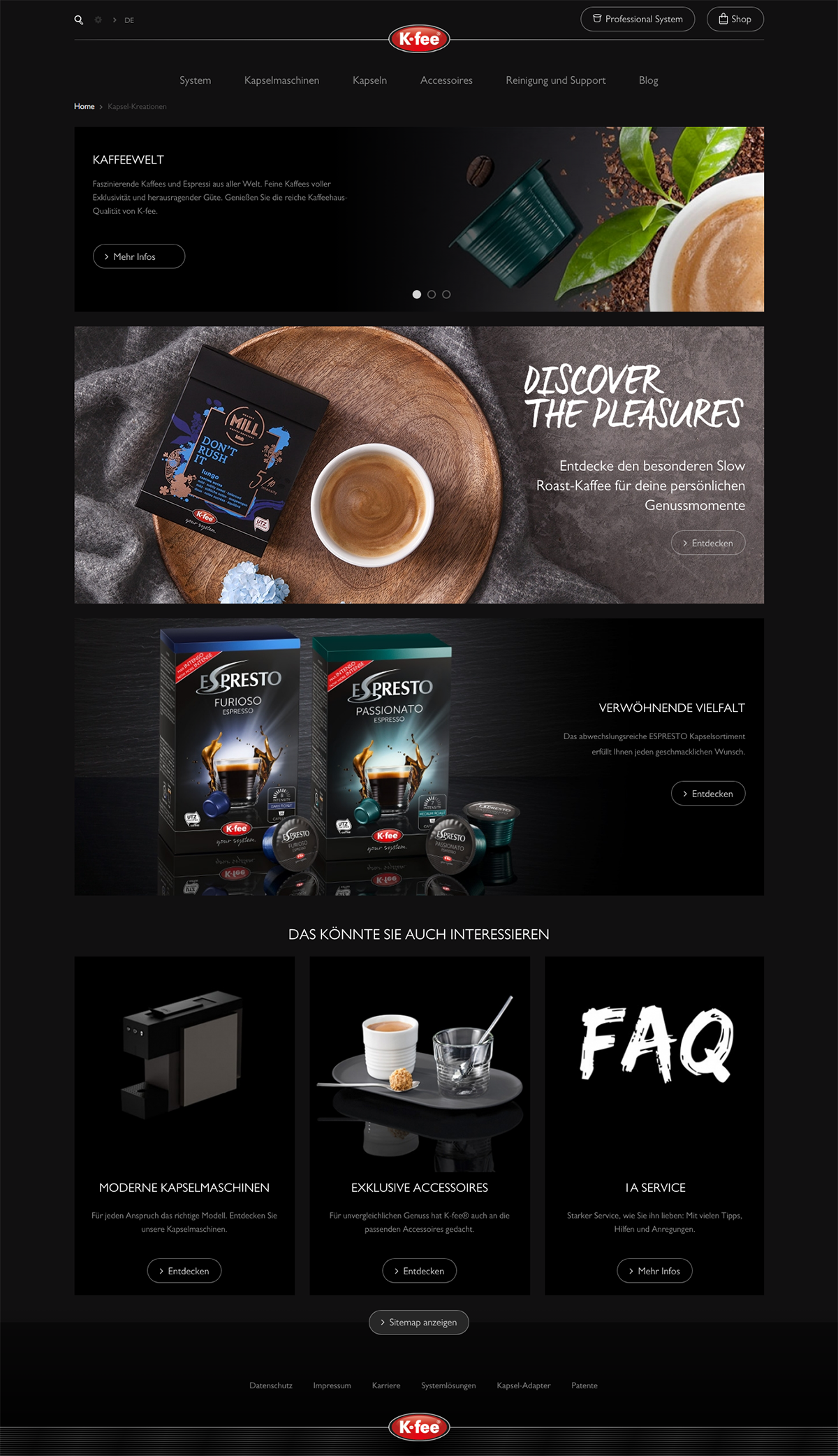
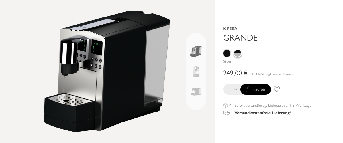
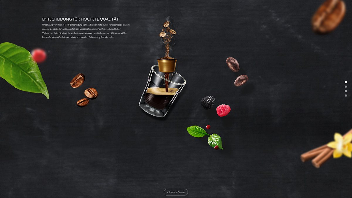
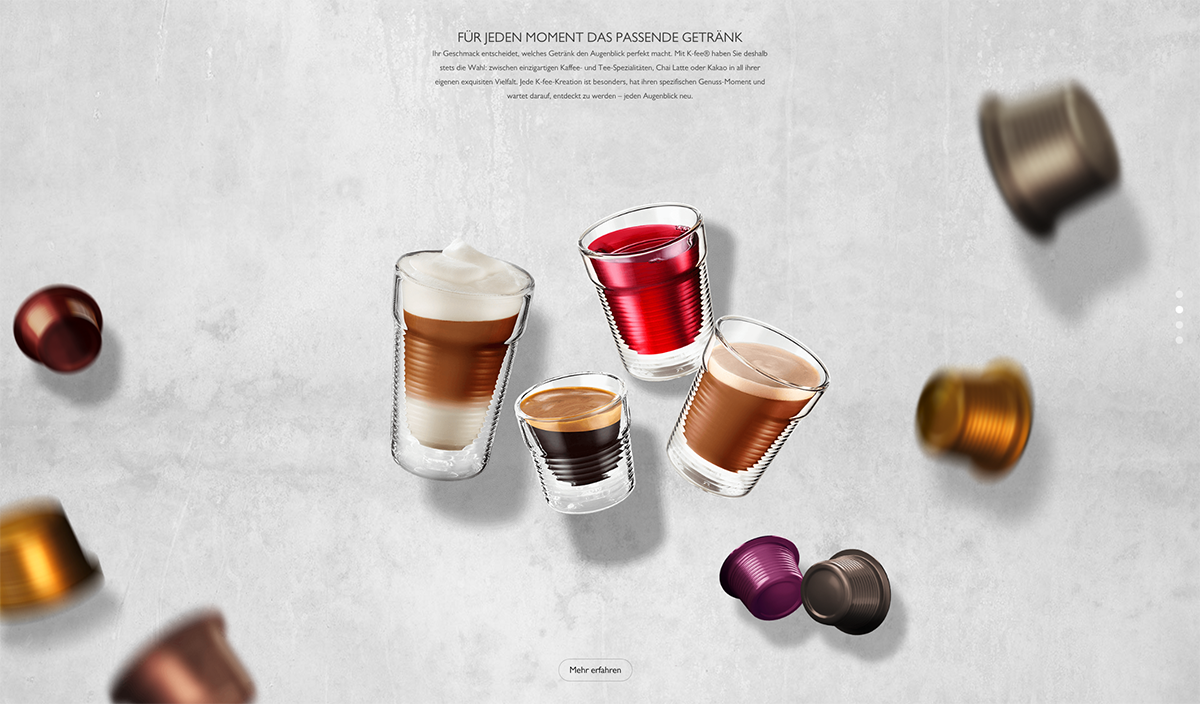
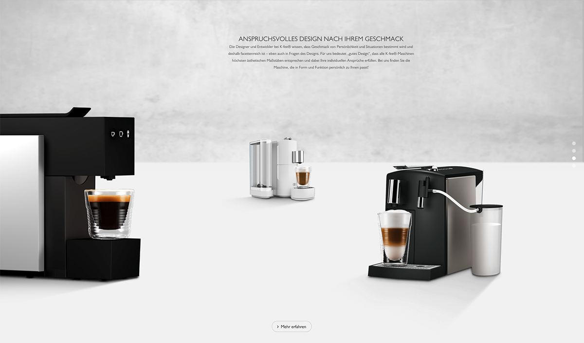
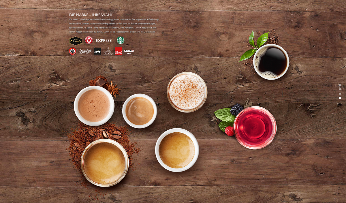
B2C- & B2B-Brandpage, B2C-Onlineshop. Frontend Development for Krüger Coffee's whitelabel capsule coffee makers Subbrand K-Fee.
B2C- & B2B-Brandpage and B2C-Onlineshop. Frontend Development for Krüger Coffee's whitelabel capsule coffee makers subbrand K-Fee.
We created a fully modularized brandworld and onlineshop which is completely controllable by the client.
I also worked as the link between the design and frontend development department.
